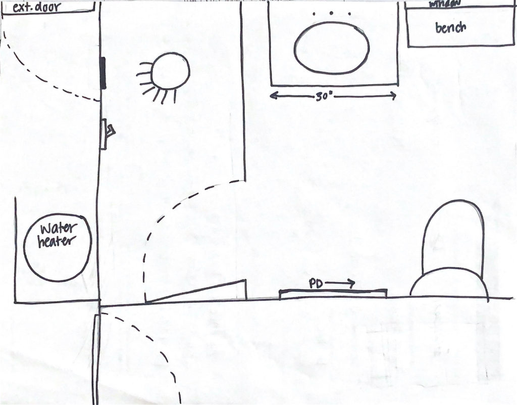
All About the Casita Bedroom
Mood boards, plans, and the explanation for why we even did this project are all in this post.
All the details of the bathroom (my favorite room in our entire house!) can be found in this post.
The Overall Vibe:
I wanted the space to feel light, airy, and homey/comfortable. I also wanted it to feel new, but with nostalgic touches.
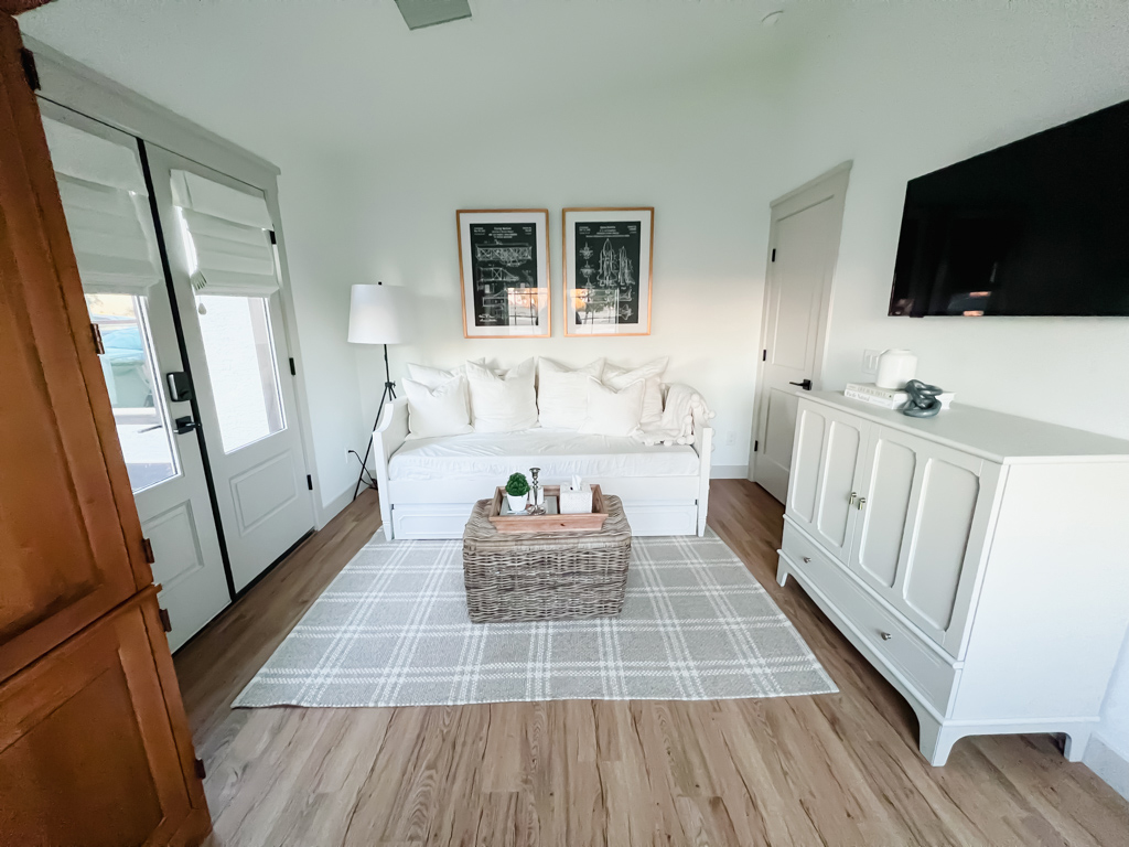
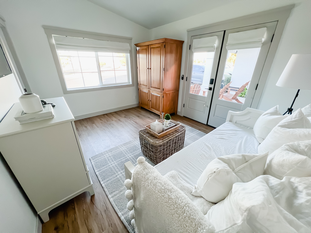
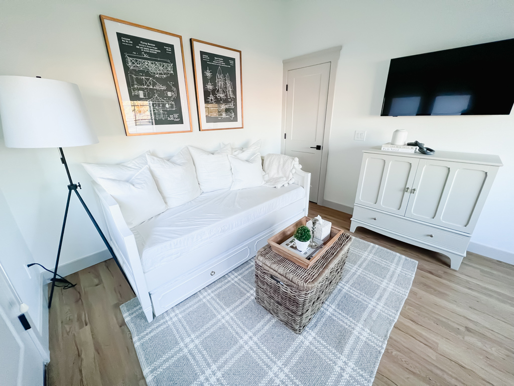
I incorporated some older items like the oak armoire and vintage patents. But some of the new items also had a vintage/nostalgic feel. The trundle bed and media chest have traditionally designed moulding, and I made sure the window and door trim and the window treatments were very traditional feeling.
Paint Colors:
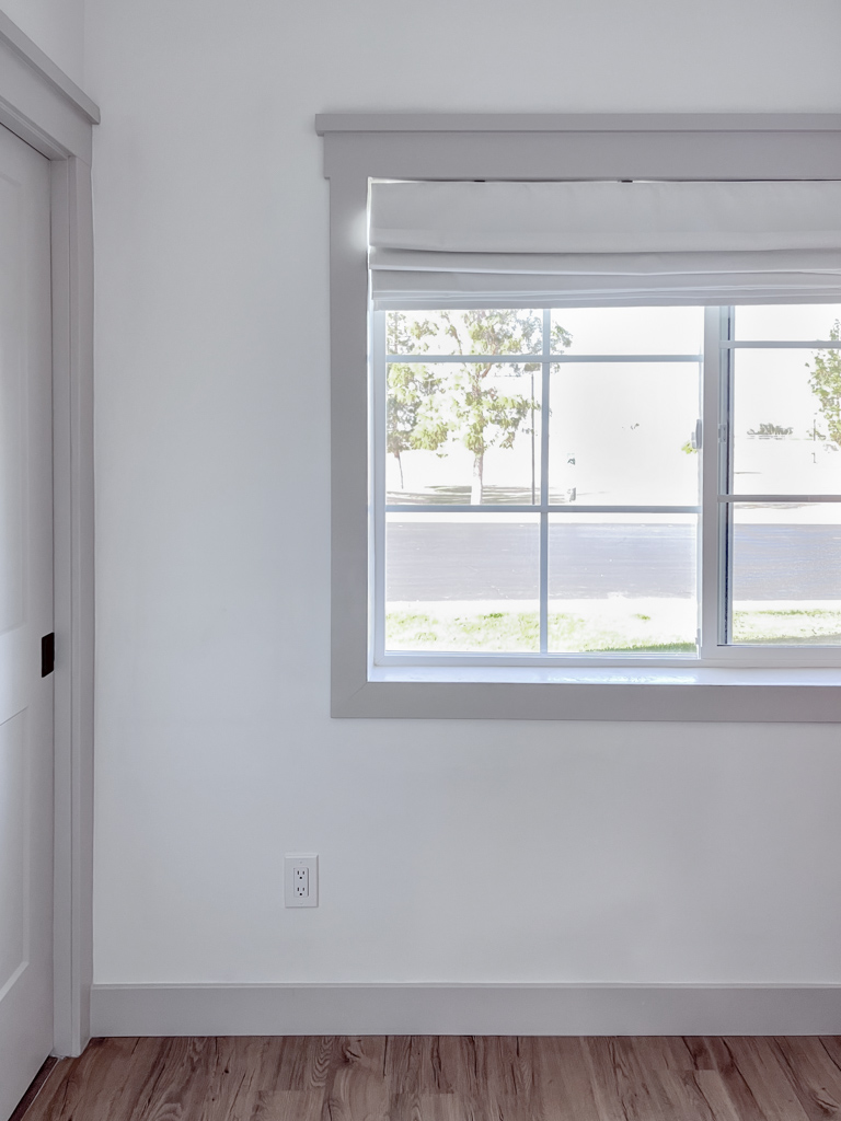
The wall color is Chantily Lace by Benjamin Moore in flat, and the trim is Agreeable Gray by Sherwin Williams in eggshell.
Flooring:
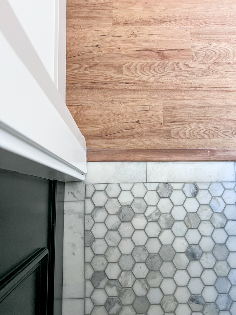
The flooring we used is DuraLux Signature Hickory luxury vinyl plank from Floor & Decor. I absolutely love the color and the feel of it – it does have the grain like real wood. I likely wouldn’t install vinyl in my own home again if I could afford the real thing. It is apparent that it’s vinyl for a few reasons. Nonetheless, I’m ecstatic about how it came out!
The bathroom flooring is Sahara Carrera 2″ hexagon mosaic and Sahara Carrera Marble Tile, which I both love and are both from Floor & Decor. More on the bathroom in this post.
Trim, Windows & Doors:
For the trim, I wanted a really traditional feel but with a modern line. I love door casing – to me it feels so “finished”. But instead of the more ornate trim you may see, I opted for something flat, but we added a larger 1×1 on top for dimension.
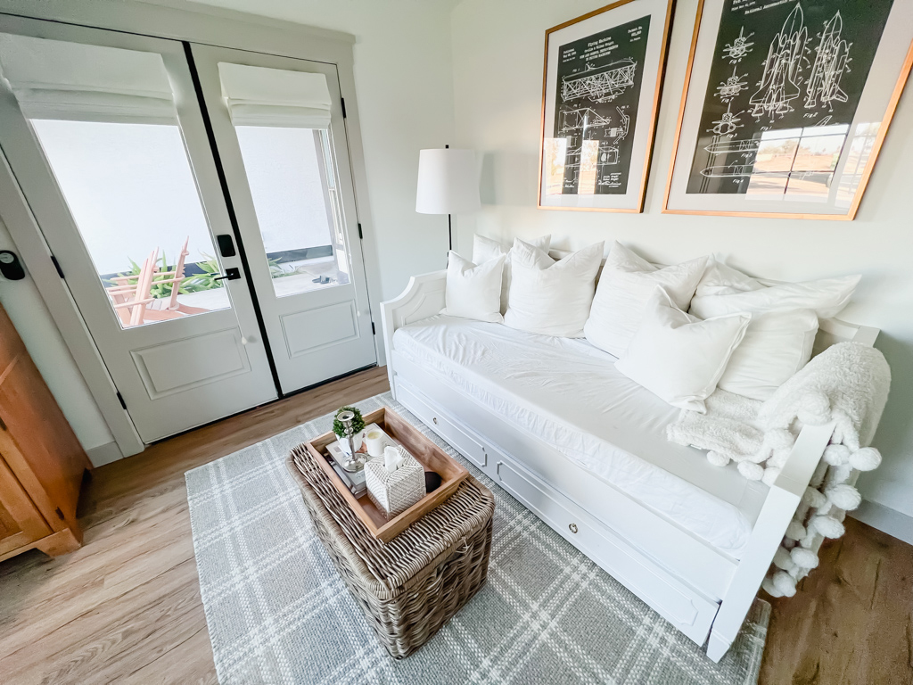
The French doors we had to get custom because I had a vision! But these doors were less expensive and the inspiration for it. The outside is the same white as our house, and the inside is Agreeable Gray – the same color as our trim.
Furniture:
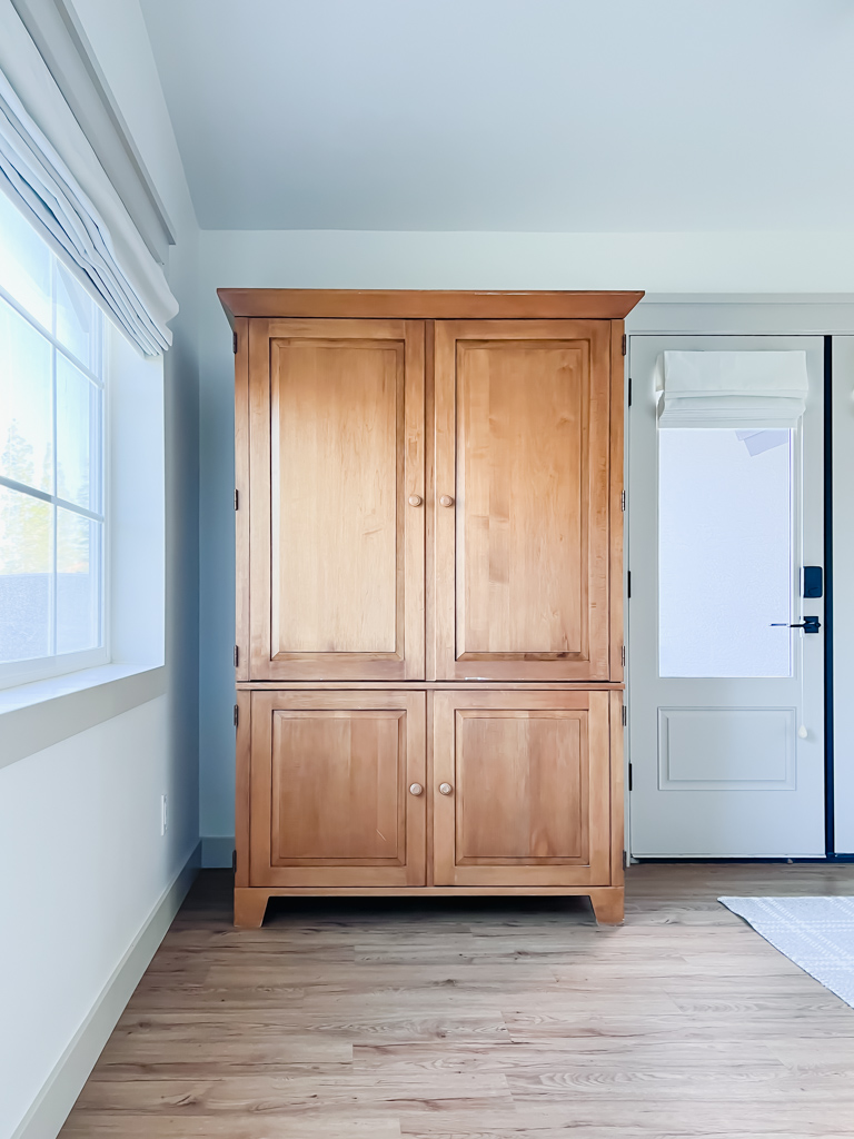
- The armoire is Ethan Allen and was gifted to us. It worked out so perfectly for this space with the look/feel and the functionality…it’s also a desk! This room doubles as Danny’s office.
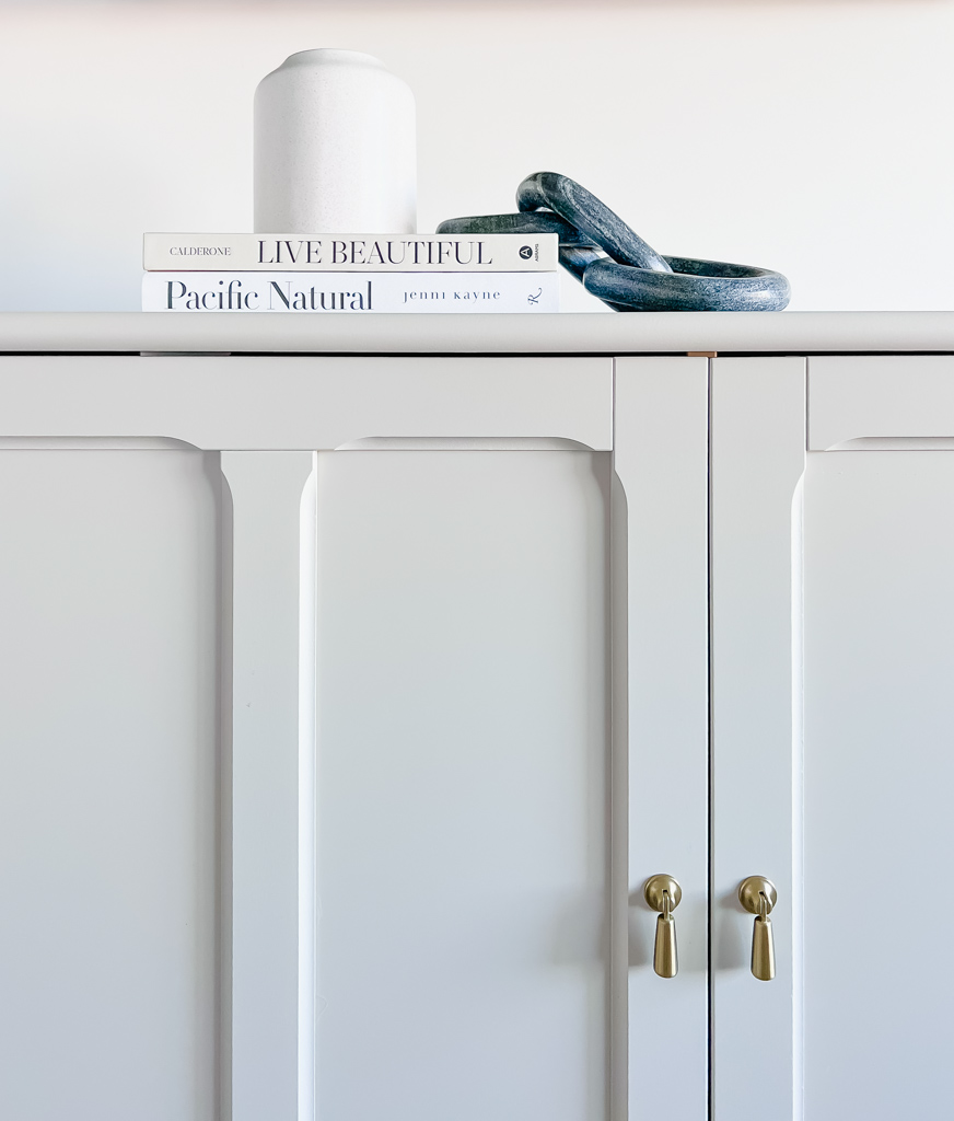
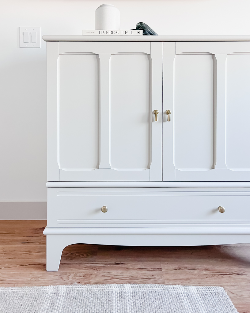
- The media chest is the taupe cabinet from IKEA’s new LOMMARP line. Everything from the line is beautiful! I really want the hutch from the line but I have nowhere to put it. It’s higher priced than your average IKEA, but for a reason! It’s way heavier and more substantial than the college dorm furniture you’re used to.
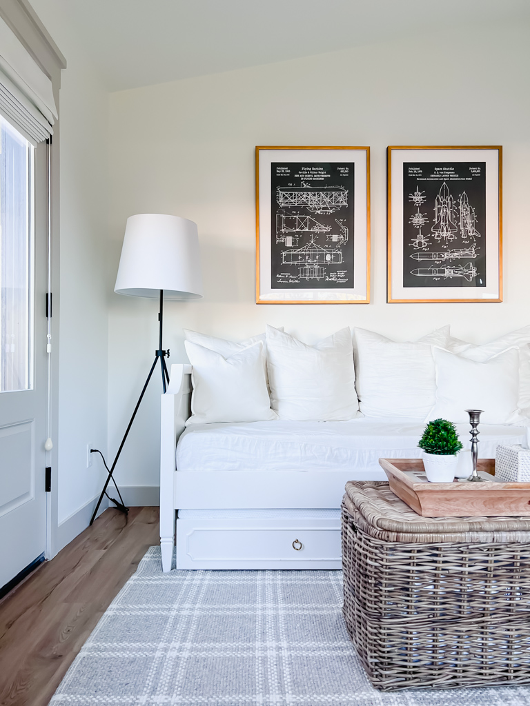
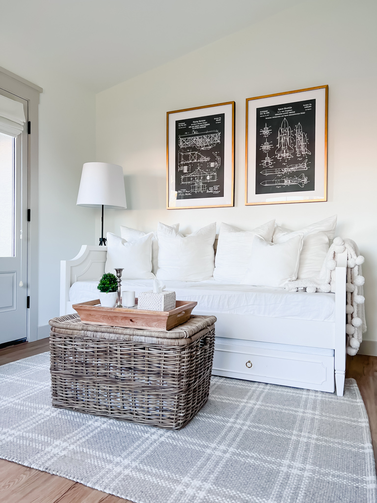
- Rug: I knew I wanted something with personality for this neutral space. I typically only do solid and textured rugs, so this one is a reach. I saw it at Target and knew it would be perfect in the space. It brings the grays and whites together in the room by incorporating both into one grounding piece.
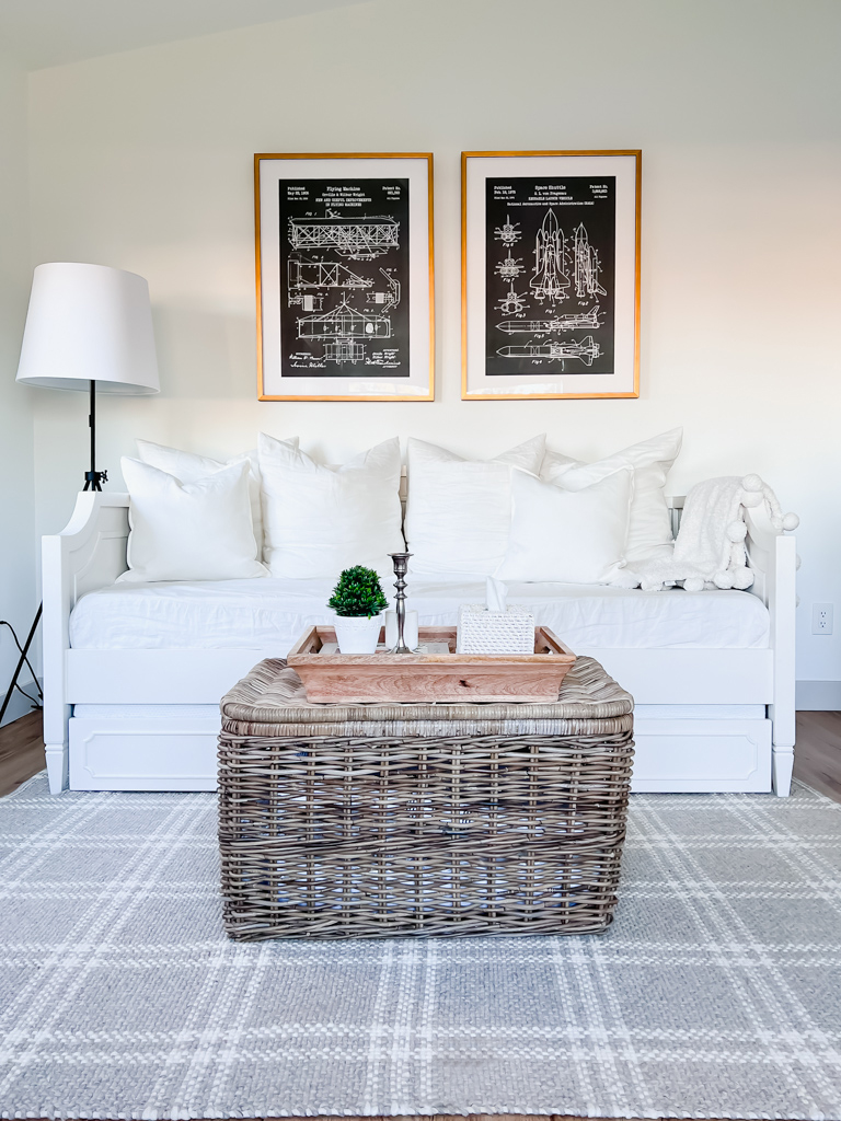
- Basket coffee table: We needed some more storage for guest linens, and I didn’t want a huge coffee table in this space because I wanted it pretty open to move around and to make room for the trundle for when guests sleep here. So this basket was the perfect solution. The extra plus was that it was only $70! Way cheaper than a coffee table.
Decor:
The decor I wanted to keep simple – with neutral textures and patterns, and still staying true to the “modern vintage” vibe.
The art: I wanted to do something special for Danny in “his” new space (it’s actually mainly his office), and he is into anything with an engine – cars, planes, rocketships, etc. So I got him this pair of patents on Etsy for our first anniversary – the “paper” gift.
The frames that the patents are in are the Olympia from Framebridge. I loved their process – so easy and affordable for custom framing.
I loved this floor lamp because of its clean lines and simplicity, and I chose a black base to bring the art together.
I added all the links, plus some more here:
